
Foundr
Foundr is a lost-and-found technology ecosystem for college campuses. It pairs a mobile app with secure physical lockers — drop-off and pickup points for lost items — designed so that recovering something during a stressful moment feels calm and reassuring.
- Role
- Product Designer
- Timeline
- 2026
- Type
- Product Design
- Tools
- Figma

A lost-and-found technology ecosystem for college campuses — a calm mobile app paired with secure physical lockers, designed so recovering a lost item feels supportive instead of stressful.
- Role
- Product Designer
- Timeline
- 2026
- Type
- Product Design
- Tools
- Figma
- Outcome
- One product across two very different surfaces — a private phone screen in a stressful moment and a public kiosk used in seconds — held together by a single shared visual language.
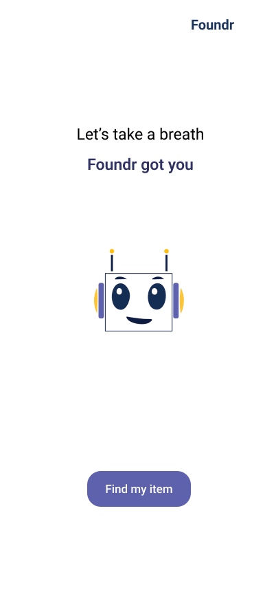
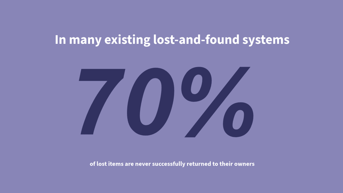
Losing something is already the bad moment
Losing keys, a laptop, or a wallet on campus is a small panic — and most lost-and-found systems make it worse: a scattered email, a desk that's closed, a form that asks the wrong questions. The design problem wasn't logistics. It was emotion.
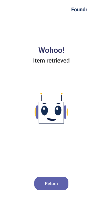
Foundr's job is to answer the one quiet question behind a lost item — what do I do next? — at every step, calmly.
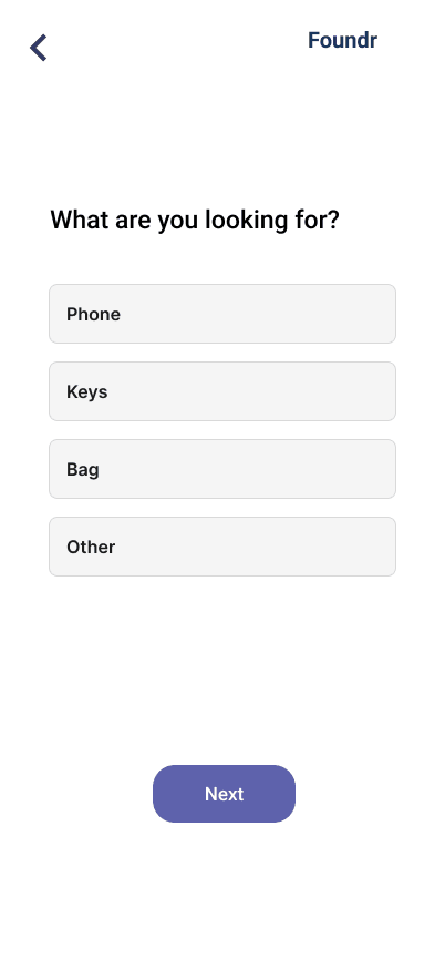
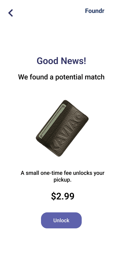
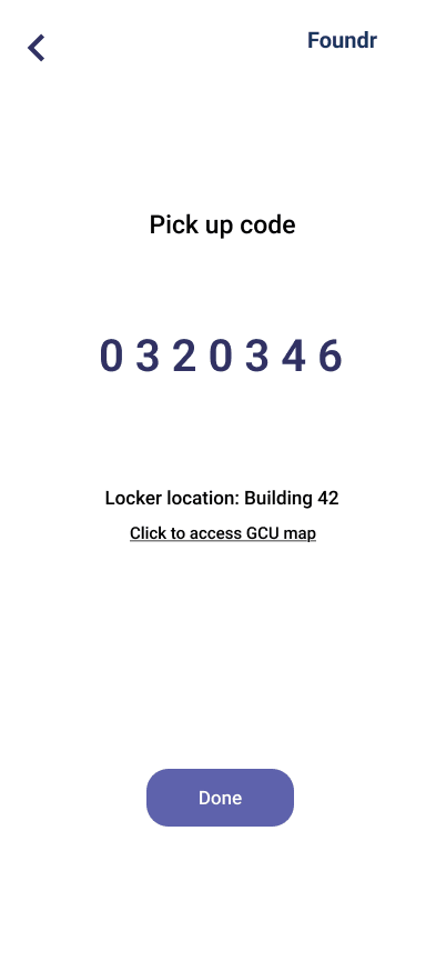
Reducing friction in a stressful moment
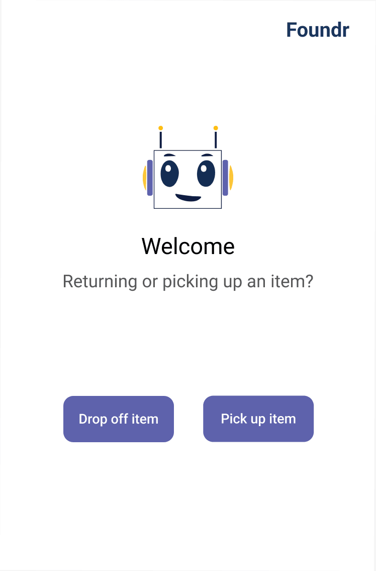
For the app, the goal was emotional before it was functional. Losing something is overwhelming, so the flow prioritizes clarity, guided inputs, and visual reassurance — never asking the user to think harder than the moment allows. The result feels calm and supportive, holding trust through consistent feedback from report to retrieval.
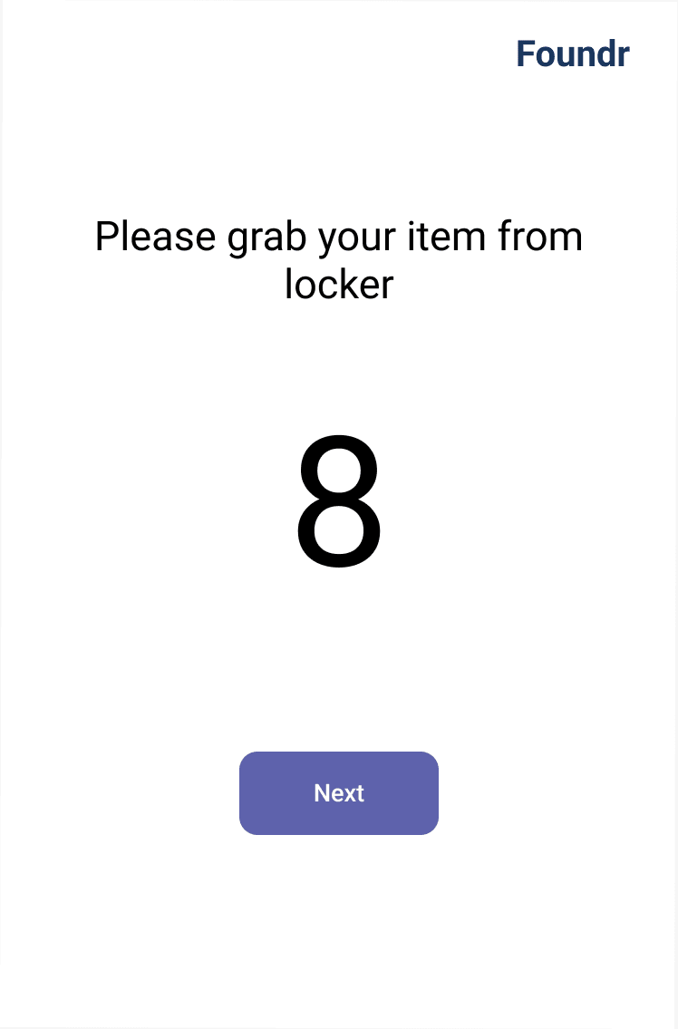
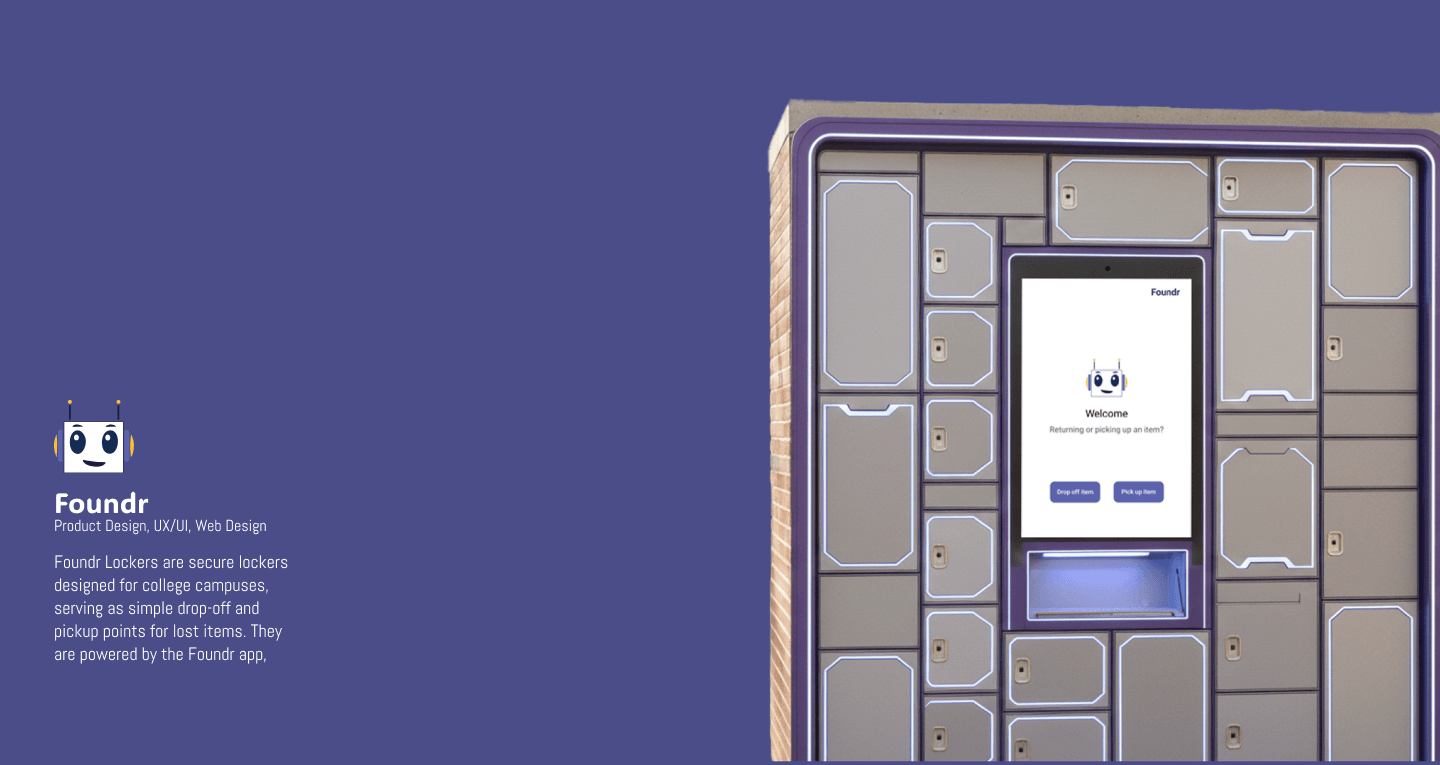
Designed for a hallway, not a desk
The kiosk is a different design problem entirely: it lives in a busy corridor, used by people in a hurry, often only once. So it trades the app's intimacy for legibility and unmistakable affordances — large type, high contrast, and one decision at a time, readable from a standing distance.
What I'd carry forward
Foundr taught me to design the same product for two very different contexts without letting them feel like two products. The connective tissue was a shared visual language — consistent components, consistent feedback, consistent tone.
That's what makes an ecosystem feel like one thing rather than an app and a machine that happen to share a name. It's the discipline I now bring to any product that spans more than one surface.