
Salt River Bikes
Salt River Bikes is a concept e-commerce site reflecting the bold energy of Arizona's riding culture. The project explores how strong branding, intentional layout systems, and user-focused design elevate a performance-driven shopping experience.
- Role
- Web Designer
- Timeline
- 2026
- Type
- Web Design
- Tools
- Figma

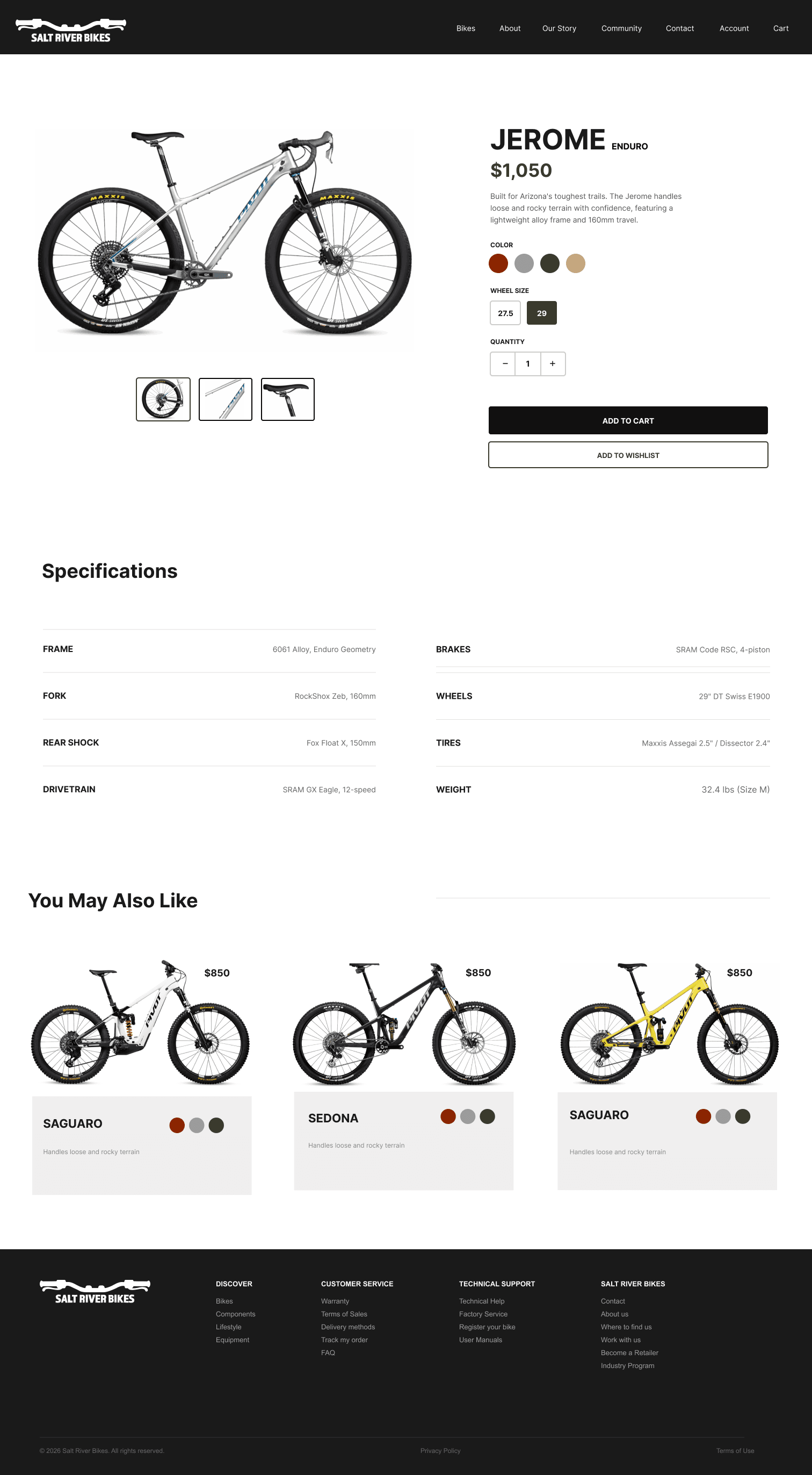
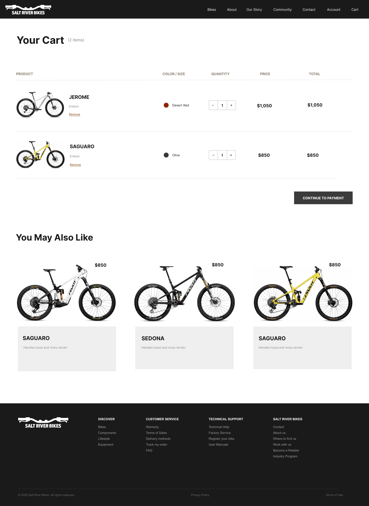
A concept e-commerce site for an Arizona bike brand, built from wireframes up to a full multi-page storefront — home, product catalog, product detail, and cart — that balances immersive lifestyle imagery with the structured usability shopping needs.
- Role
- Web Designer
- Timeline
- 2026
- Type
- Web Design
- Tools
- Figma
- Outcome
- A complete e-commerce flow — browse → product → cart — where bold desert branding and a strict grid coexist, so the site feels intense without ever getting in the way of finding a price.
Drama versus 'where's the price?'
A performance brand wants drama; an e-commerce shopper wants to find a bike, a size, and a price. Most lifestyle-driven sites pick one and lose the other — immersive imagery that buries the shopping, or a usable catalog with no soul.
The brand can be loud — but only if the usability is quietly, completely handled underneath it.
Structure before aesthetics
I started in wireframes, deliberately setting visuals aside — mapping product categories, content groupings, and conversion paths before a single color was chosen. Then I translated that skeleton into a visual system drawn from the desert: earth tones, bold type, and a hard separation between full-bleed lifestyle imagery and the interface layered over it.
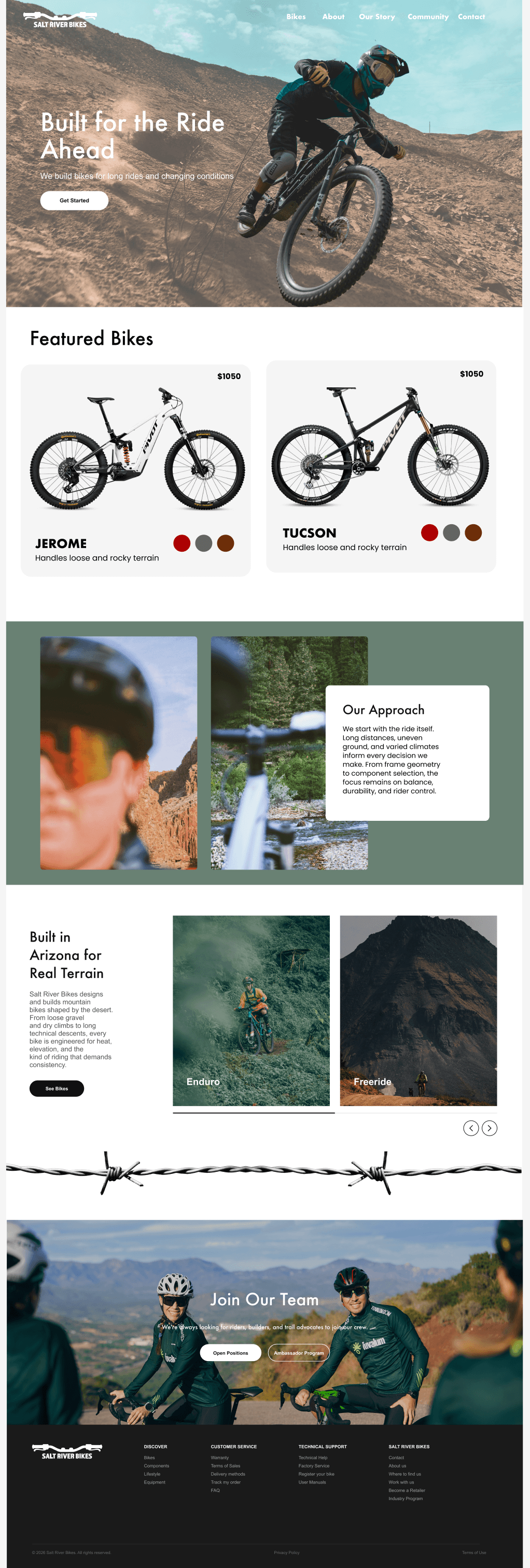
A real store, end to end
The site isn't a single pretty page — it's a working storefront. A shopper moves from a filterable catalog, to a detailed product page with specs and variants, to a cart ready for checkout. Every step holds the same scannable product cards: consistent spacing, clear pricing, visible variations.
What I'd carry forward
Salt River reinforced a discipline I now apply everywhere: earn the visuals by getting the structure right first. Wireframing the conversion paths before touching color meant the loud final design had a solid skeleton underneath.
The hardest balance was intensity versus clarity — and the answer was restraint, not compromise. Controlled whitespace and a strict grid let the desert branding stay dramatic while the shopper always knows exactly where the price, the size, and the Add to Cart button are.